
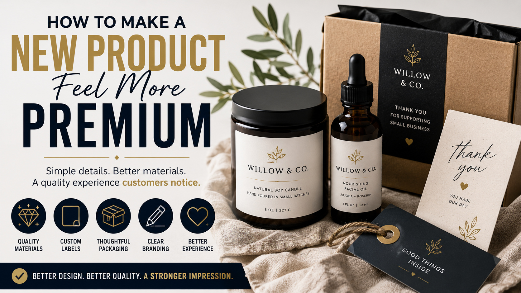
TLDR
A premium product does not need expensive packaging or an elaborate unboxing routine. It needs to feel intentional.
- Start with a product that performs well.
- Use consistent branding and a clear visual hierarchy.
- Upgrade the materials customers touch most.
- Apply clean, professionally printed product labels.
- Remove unnecessary text, colors, and packaging pieces.
- Make opening, using, storing, and reordering the product easy.
- Test the complete presentation before committing to a large production run.
The goal is not to make the product look expensive for its own sake. The goal is to make its quality easy to recognize.
Customers start evaluating a new product before they use it. They notice the container, label, photography, wording, weight, texture, and way everything fits together.
Research supports that instinct. Packaging and label design can influence how consumers judge product quality, credibility, and brand premiumness. Visual elements such as layout, shape, color, typography, and symmetry can change how a product is perceived before its actual performance is known.
That does not mean every new product needs rigid boxes, gold foil, magnetic closures, and three layers of tissue paper. In fact, adding too much can make a modest product feel like it is trying very hard to distract you.
A premium product usually feels calm, clear, consistent, and well made. Here is how to create that impression without overcomplicating the launch.
Make Sure the Product Earns the Presentation
Packaging can improve the first impression, but it cannot permanently compensate for a weak product.
Before spending heavily on presentation, check the fundamentals:
- Does the product work as promised?
- Does it feel sturdy enough for its intended use?
- Are the materials appropriate for the price?
- Is the size or quantity clear?
- Is the finish consistent between units?
- Does it arrive clean and undamaged?
- Are there avoidable leaks, scratches, wrinkles, or defects?
A polished package creates expectations. When the product inside falls short, better packaging can make the disappointment worse because it widens the gap between the promise and the experience.
Premium presentation works best when it draws attention to real strengths. That may be better ingredients, careful manufacturing, durable materials, an original design, local production, or simply a product that solves a problem very well.
Be specific about those strengths. “High quality” is vague. “Made from solid maple,” “printed on archival paper,” or “poured in small batches” gives the customer something useful to evaluate.
Decide What “Premium” Means for Your Customer
Premium does not have one universal appearance.
A premium children’s product may feel colorful, durable, safe, and easy to understand. A premium skincare product may feel clean, restrained, and clinical. A premium handmade food product may feel warm, local, and carefully produced.
Before designing the package, define the impression you want to create in a few words. For example:
- Modern, precise, and technical
- Natural, calm, and trustworthy
- Playful, creative, and well made
- Traditional, practical, and durable
- Minimal, refined, and giftable
Those words should guide the materials, colors, typography, photography, and product description.
Problems begin when every design choice communicates something different. A rustic paper label, futuristic font, neon color palette, and formal product copy may all work separately. Together, they can make the product feel unsettled.
Consistency is one of the strongest signals of care.
Create a Clear Packaging Hierarchy
Premium packaging is usually easy to understand.
A customer should be able to identify the brand, product type, variation, and important benefit without turning the package into a reading assignment.
A useful front-label hierarchy might be:
- Brand name
- Product name
- Variety, scent, flavor, or model
- One short benefit or distinction
- Size or quantity
Secondary information can go on the side, back, bottom, or accompanying insert.
This does not mean every package must be extremely minimal. It means the information should have an order. Large type communicates what matters first. Smaller type handles supporting details.
Avoid making the logo, product name, flavor, product benefit, weight, certification marks, social handle, URL, and promotional message compete at the same size. When everything is emphasized, nothing is.
White space also helps. It gives the important elements room to breathe and can make packaging feel more controlled. Research into premium package design has examined how space, visual texture, shape, and typography contribute to luxury and quality perception.
Upgrade the Parts Customers Actually Touch
You do not need to improve every packaging component equally.
Focus on the pieces the customer handles first and most often:
- The product container
- The closure or lid
- The main label
- The shipping box or retail package
- The insert directly above the product
- Any reusable storage piece
A rigid bottle with a smooth cap may feel better than a thin bottle with an elaborate outer box. A sturdy mailer with a clean seal may create a better impression than a decorative insert placed inside a crushed package.
Small material changes can make a noticeable difference:
- Slightly heavier paper
- A cleaner box fit
- A matte or soft-touch surface
- A cap that closes firmly
- A label that does not wrinkle
- A container that stands evenly
- A bag that reseals properly
- A package that does not rattle excessively
The goal is not weight for the sake of weight. It is avoiding components that feel flimsy, loose, rough, or temporary.
Texture and material quality affect the way customers interpret packaging. Sturdy structures, clean finishes, and thoughtful material choices can support a stronger perception of product value.
Use Better Product Labels
A good label can make a standard jar, bottle, bag, box, or mailer look like a finished retail product.
The label needs to be:
- Straight
- Properly sized
- Easy to read
- Consistent between units
- Appropriate for the surface
- Resistant to the conditions it will face
A candle label does not need the same material as a refrigerated drink label. A product exposed to oil, condensation, moisture, or frequent handling needs a material and adhesive selected for those conditions.
Professionally printed product and packaging stickers can give small production runs a consistent finish without requiring fully custom containers. Custom shapes and sizes also allow the label to fit the package instead of looking like an unrelated rectangle placed over it.
For larger quantities, custom roll labels can make repeated application faster and more organized. CustomStickers.com offers roll and sheet formats for different packaging workflows, along with options for custom shapes and materials.
Before ordering a full run, print the design at actual size. Place it on the real container and view it from several feet away. A label that looks spacious on a large computer monitor may feel cramped when reduced to two inches.
Choose the Right Finish
Gloss, matte, clear, textured, metallic, and specialty finishes create different impressions.
A gloss finish can make colors appear bright and saturated. It works well for bold illustrations, food products, colorful cosmetics, toys, and products that need an energetic presentation.
A matte finish usually feels quieter. It reduces glare and can support natural, modern, understated, or technical branding.
Clear labels allow the container or product color to remain visible. They work especially well on glass, clear plastic, light-colored surfaces, and products where seeing the contents builds trust.
Metallic and holographic effects can draw attention, but they should support the product rather than overwhelm it. A small metallic detail may feel considered. Covering every available surface in reflective material can make basic information harder to read.
Premium does not automatically mean matte, black, or gold. Those choices have become shortcuts, and shortcuts are easy to spot.
Use the finish that fits the product.
Simplify the Color Palette
More colors do not make packaging feel more valuable.
A controlled palette is easier to recognize and repeat across labels, boxes, website graphics, product photography, and promotional materials.
Start with:
- One primary brand color
- One or two supporting colors
- A neutral background
- A clear text color
Product variations can use a secondary color system. For example, each candle scent, coffee roast, or skincare formula might receive its own accent color while keeping the main layout consistent.
Make sure the colors reproduce accurately in print. Very bright RGB colors shown on a monitor may not reproduce the same way with standard CMYK printing. Order a proof or sample when color matching matters.
And maintain enough contrast. Pale gray text on an off-white background may look refined on a large screen but become frustrating on a small label.
Customers should not have to struggle to read something simply because the design wanted to be subtle.
Use Fewer, Better Fonts
Typography carries a surprising amount of the brand’s personality.
A serif typeface may feel established, editorial, traditional, or crafted. A clean sans serif may feel modern, direct, or technical. A handwritten font may feel personal, but it can quickly become difficult to read.
Most product packaging needs no more than two typefaces:
- One for the brand or display text
- One for descriptions, instructions, and supporting information
You can create hierarchy using size, weight, spacing, and capitalization instead of adding more fonts.
Avoid using a decorative typeface for ingredients, warnings, dimensions, or instructions. Those details need to be understood, not admired from a safe distance.
Make the Packaging Fit Properly
Fit is one of those details people may not consciously notice until it is wrong.
A box that is far too large for the product can feel wasteful. A loose insert allows the item to shift and may make it seem less substantial. A bag with too much empty space can make the customer wonder if something is missing.
Use inserts, dividers, tissue, or paper fill when they protect the product or improve presentation. But do not add material without a purpose.
The package should:
- Protect the product
- Keep it organized
- Open without a struggle
- Avoid unnecessary empty space
- Be easy to store or discard
- Arrive in good condition
A clean fit makes the product feel considered. It also reduces the chance of damage during delivery.
Improve the Unboxing Experience Without Adding Clutter
An unboxing experience does not need to be theatrical.
In most cases, customers want to open the package, understand what they bought, and start using it without working through six layers of branding.
A simple sequence might be:
- Open the shipping package.
- See the product neatly presented.
- Find a short thank-you or instruction card.
- Remove the product without cutting, tearing, or guessing.
- Understand how to use or care for it.
That is enough.
A branded sticker can seal tissue paper or close a box. A small printed insert can explain setup, care, or storage. A QR code can link to a longer guide without adding several pages of printed instructions.
Every added piece should do something. If the insert repeats the box, the box repeats the label, and the label repeats the website, the customer is mostly paying to receive the same sentence four times.
Write Product Copy That Sounds Confident
Premium product copy is specific and restrained.
Avoid vague claims such as:
- The highest quality
- Truly luxurious
- A game-changing product
- Made with the finest materials
- Unlike anything else
- The perfect solution
These phrases sound impressive until the customer asks what they mean.
Replace them with useful facts:
- Materials
- Dimensions
- Ingredients
- Manufacturing method
- Expected lifespan
- Care instructions
- Where it was made
- What is included
- What makes it different
- Who it is designed for
Clear language creates confidence. It also lowers the risk that the packaging promises more than the product can deliver.
Premium brands do not need to shout “premium” repeatedly. They show their work.
Use Better Product Photography
A new product can lose much of its perceived value through poor photography.
Use images that show:
- The complete product
- The package
- Important details
- Scale
- Texture
- The product in use
- What the customer receives
Keep the lighting and editing consistent across the product line. Use clean backgrounds unless the environment adds useful context.
Do not rely entirely on lifestyle images. Customers still need a straightforward view of the product. And avoid editing colors so heavily that the actual item looks different when it arrives.
The photography, website, packaging, and product should feel like parts of the same brand. If the online listing looks polished but the package arrives with a blurry label and unrelated colors, the presentation falls apart.
Add a Thoughtful Extra
A small extra can improve the experience when it feels relevant.
Good options include:
- A useful care card
- A replacement part
- A small sample
- A branded sticker
- A storage pouch
- A measuring tool
- A simple thank-you note
The extra should support the product or customer relationship. Random promotional items can create clutter and increase cost without adding much value.
A branded sticker is useful because it is inexpensive, easy to include, and separate from the product’s required packaging. Customers can keep it, share it, or ignore it without affecting their ability to use what they bought.
Price the Product Consistently With Its Position
Presentation, product quality, and price need to make sense together.
An extremely low price can create doubt when every other part of the product signals careful construction and higher value. But a high price will not rescue an ordinary product with poor materials or inconsistent fulfillment.
Premium pricing should be supported by visible reasons:
- Better ingredients or materials
- Original design
- Specialized manufacturing
- Improved durability
- Better performance
- Limited production
- Strong customer support
- More useful packaging
- A clear guarantee or return policy
Research on brand premiumness suggests that customers connect price, brand associations, and perceived quality. But buyers are also increasingly critical when high prices are not supported by better value or performance.
Price with confidence, but make the value easy to understand.
Test the Full Experience Before Launch
Do not review the label, package, product, insert, and website separately.
Assemble the full customer experience.
Pack the product exactly as it will ship. Leave it overnight. Open it the next day as though you were the customer.
Look for:
- Crooked or lifting labels
- Smudged printing
- Excessive empty space
- Hard-to-open packaging
- Confusing instructions
- Inconsistent colors
- Loose components
- Damage caused by shipping movement
- Unnecessary packaging pieces
- Missing product information
Send several sample packages through the actual shipping process. A package that looks excellent on the packing table may arrive differently after traveling through sorting equipment and delivery vehicles.
Small test runs are especially useful for a new product. They allow you to adjust the label size, packaging fit, wording, and materials before buying thousands of units.
A Simple Premium Product Checklist
Before launching, confirm that:
- The product performs as promised.
- The package fits without excessive empty space.
- The brand colors and fonts are consistent.
- The main label is straight, readable, and correctly sized.
- The product name and variation are easy to identify.
- The materials fit the intended price.
- The opening sequence is simple.
- Instructions are easy to find.
- Product photography accurately represents the item.
- Every insert or extra has a purpose.
- The full package survives shipping.
- The product is easy to reorder or recommend.
You do not need to spend heavily on every item. Fix the most noticeable weaknesses first.
Premium Is Mostly About Good Judgment
Making a new product feel more premium is not a matter of adding the most expensive packaging options available.
It is about removing uncertainty.
The product should feel sturdy. The label should look intentional. The information should be clear. The package should open properly. The photography should match what arrives. And each design choice should make sense beside the others.
Start with the parts customers touch and notice first. Improve those details, test the complete experience, and keep the presentation consistent.
That approach is less dramatic than covering everything in gold foil. It is also much more reliable.
References
Research on packaging symmetry, shape, and perceived brand premiumness.
Research on the effect of visual packaging elements on consumer decisions.
Research on packaging design as a branding and communication tool.
CustomStickers.com product and packaging label information.